Portfolio


Emily Patricia
recent works
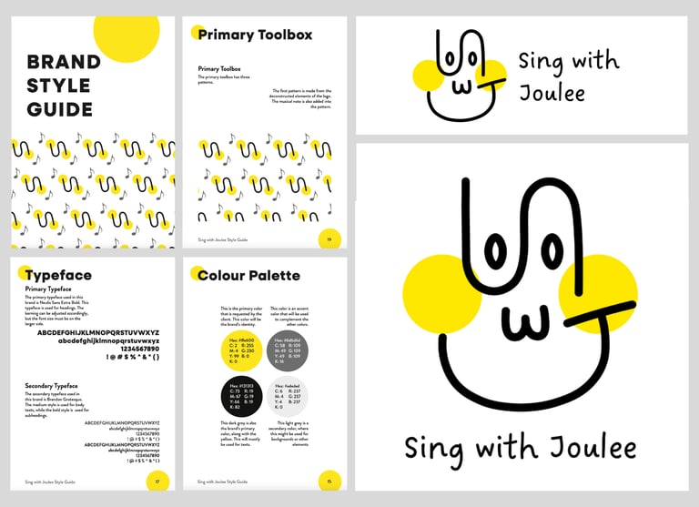
SWJ Re-branding
I'm satisfied with how the SWJ rebranding turned out. The new direction aligns well with the business's values and was well-received by the client. The logo redesign feels creative and intentional, and both the color palette and brand toolbox complement the overall identity. One consideration going forward is consistency in application, particularly with the second toolbox, which may require clearer guidelines to maintain cohesion across touchpoints.
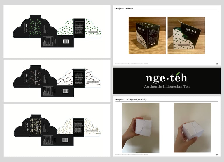
Tea Brand Packaging
I'm quite satisfied with the mockup overall. The clean design features a simple black, white, and grey palette accented by the tea's colour, while the pattern adds a fun touch without disrupting the minimalistic feel. However, the paper choice caused cracking on folded edges, the sizing was a little tight, and the opening mechanism wasn't very ergonomic. These are refinements I'd address in the next iteration.
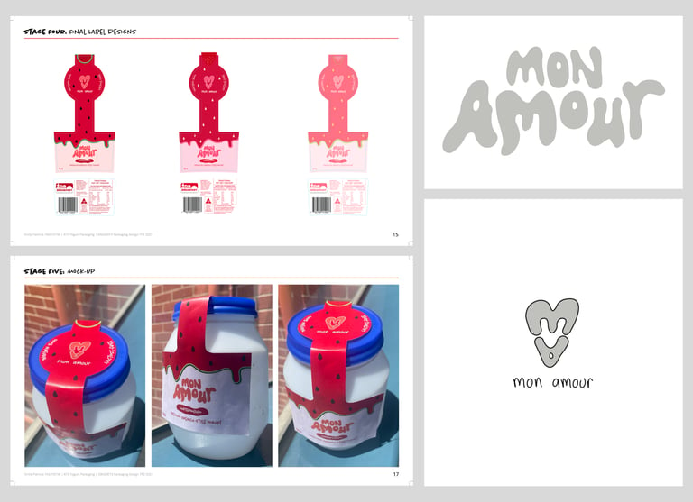
Yogurt Brand Packaging
The design is fun and eye-catching, with bright pinkish colours chosen to stand out on the shelf and appeal to the target market. The graphic elements all serve a purpose: the fruits on top communicate the flavour when viewed from above, the fruit colour and seed pattern create a mouth-watering feel, and the melting effect hints at the yogurt's smooth texture. Every detail was designed to help customers instantly get a sense of what the product tastes and feels like.
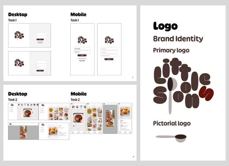
Little Spoons Application UI/UX
The design was built around making things easy to use, backed by user testing. The layout, fonts, and colours were all chosen with clarity in mind, and the results showed that users could navigate through tasks quickly on both desktop and mobile. I'm also happy with how the logo turned out; it feels cohesive and ties the whole look together nicely. Testing highlighted a few improvements, like saved recipes and smoother navigation, which are good next steps for refinement.
click to see more...

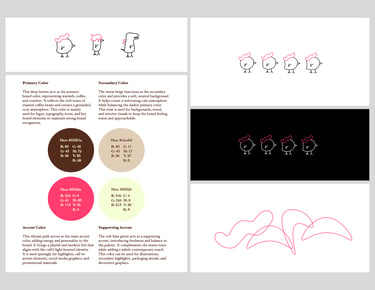
WARA Cafe Visual Identity
The mascot is a hand-drawn chick that is simple and instantly likeable. The chick's hat is drawn from the W in WARA, tying the mascot directly to the wordmark in a way that feels considered and intentional. Character variations keep it versatile across packaging, socials, and in-store touchpoints without feeling repetitive. The colour palette brings it all together to keep everything balanced and fresh. A flexible foundation that feels genuine and ready to grow with the brand.
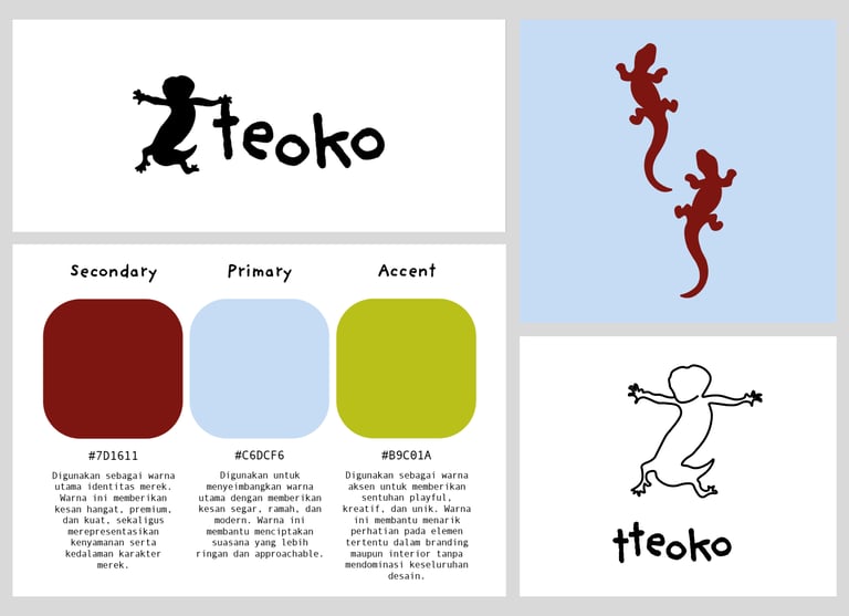
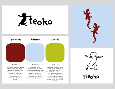
tteoko Visual Identity
Tteoko's branding combines a creative minimalist aesthetic with inviting tones and playful pops of colour. Inspired by the similarity between the name "tteoko" and the Indonesian word tokek (gecko), the brand incorporates a gecko silhouette mascot as a distinctive visual element. The mascot adds a memorable and lighthearted character to the brand while reinforcing its unique identity in a subtle, modern way.